02 | The Strategy
Design how the packaging behaves before deciding how it looks
Before developing any visual family, we tested the relationship between outer form, opening mechanism and sequence of reveals. The physical experience received as much attention as the artwork, and the architecture of the package was resolved with its everyday use in mind: how it is held, lifted, unfolded, closed again and kept.
Design the opening before the artwork
The first question was what the recipient should encounter first, second and third. We worked through mechanics and sequencing before treating the box as a finished visual object. The result was a repeatable physical system that supports different occasions and expressions while keeping one recognisable way of opening a Misree gift.
Treat packaging as a pricing instrument
The physical interaction with a gift shapes how the product is valued. Time spent with a gift deepens how it is perceived and remembered. For Misree, that interaction became design logic: different lid options, layered openings, folding formats and individually presented containers give the recipient more to discover before reaching the full assortment.
Build one platform for a continuous calendar
Rebuilding the physical foundation for every season creates unnecessary development demands. We used the core hamper architecture as a central platform for multiple festive collections. The Enchanting Forest range launched in four colourways on the same system, supporting Diwali, wedding season and corporate gifting at once.
Let illustration carry the season
The structure stays constant while the surface changes. Four colourways create four gifting moods from one system.
● olive green ● dusty rose ● deep violet ● warm khaki
Sparkling Celebrations, Baby Blue Wildlife and the Pouch System extend the range into other visual registers. The principle behind all of it is simple: build physical assets before seasonal graphics, design systems that carry many occasions, treat opening and discovery as part of perceived value, and let illustration adapt the system across the year.
03 | Design Thinking
Each format sits at its own price point and occasion. The structure creates the interaction; the surface suits the moment.
Sparkling Celebrations: Two Ways to Reveal the Gift
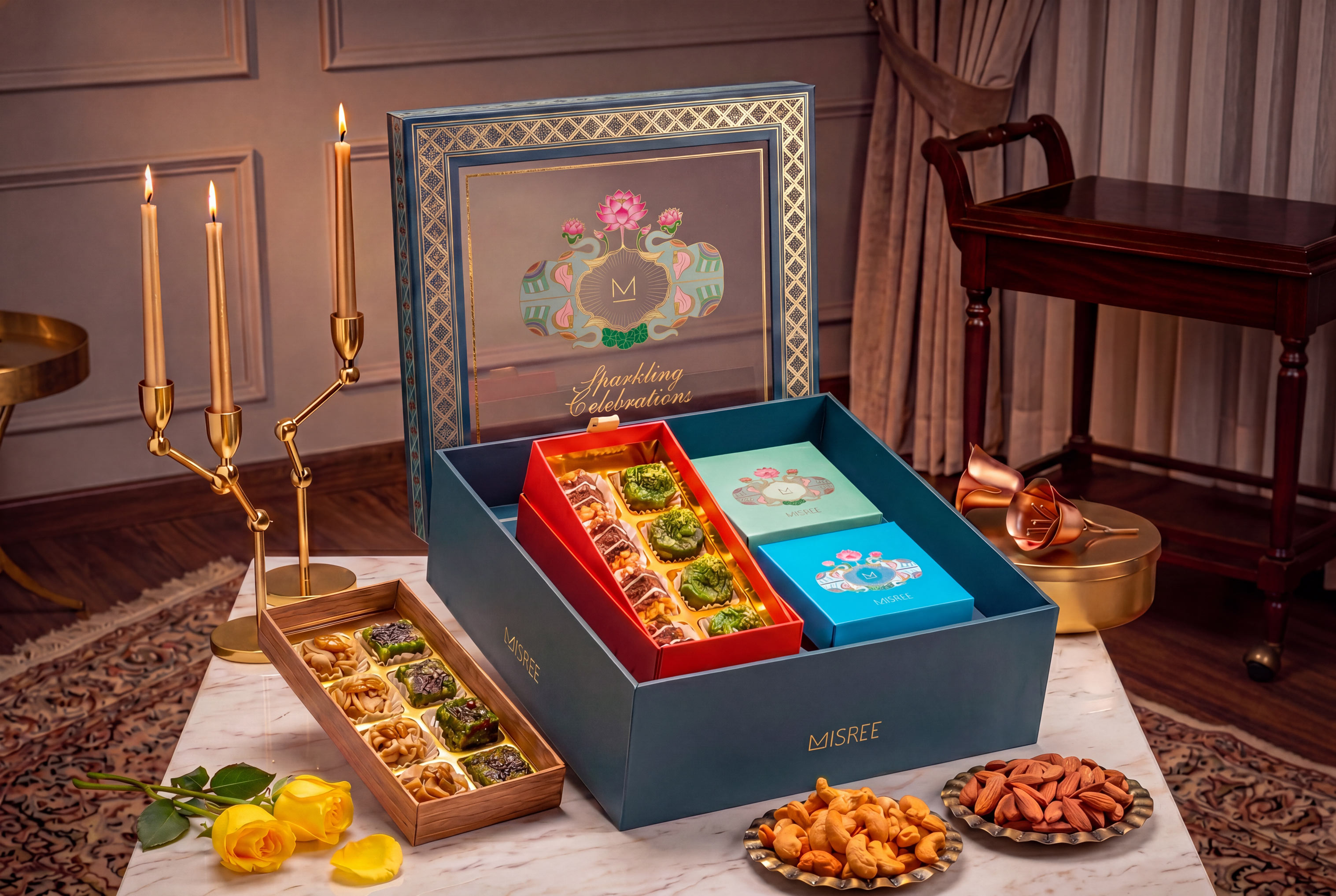
A teal blue base, jewel textile border and lotus-and-elephant crest, with two lid options. A transparent PVC lid presents the interior as a framed still life before the hamper is opened; a solid lid withholds that reveal. Inside, nine individually presented transparent boxes sit in a composed grid. The lid changes the first encounter while the interior stays equally ordered.
Peacock Fold: a gift that opens into a display
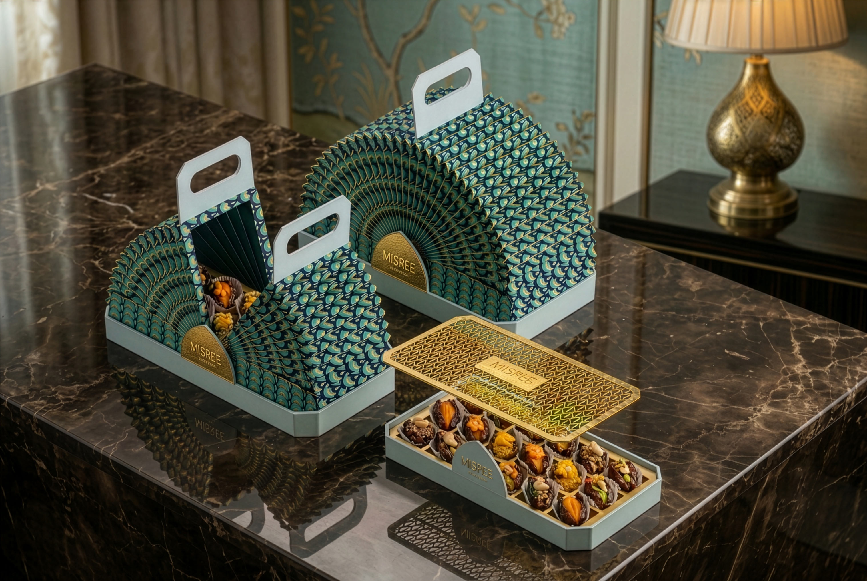
A harmonium-fold format spanning 12.4857 inches. Closed, it reads as a contained carrier. Opened, it expands into a full fan display and the peacock feather illustration resolves across the spread. The gold mithai tray appears only once the package is fully extended, leaving a display that stays relevant after the mithai is gone.
Oval Capsule: four stages of discovery
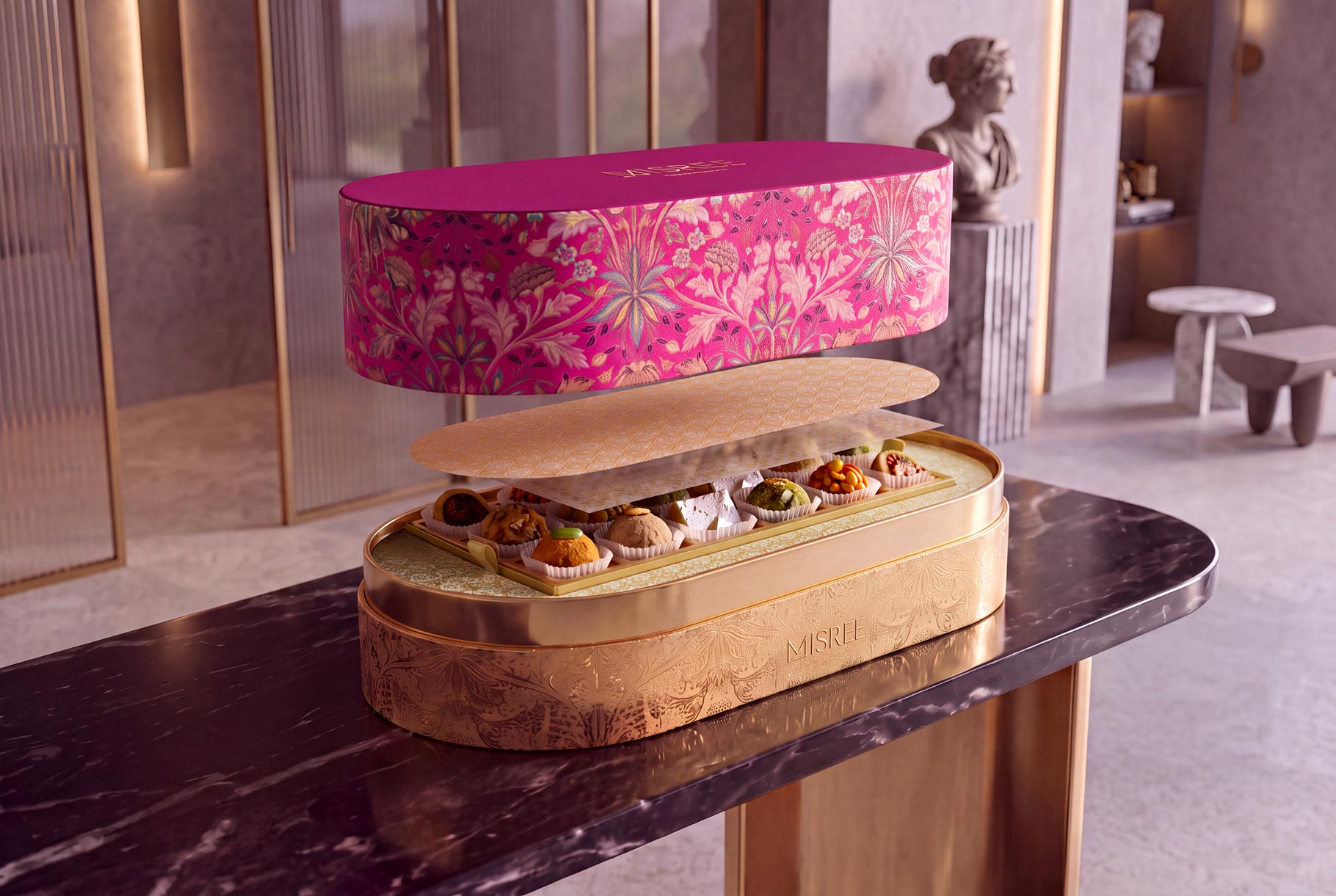
Twenty-four pieces held across a sequence: lid, butter paper, first tray, second butter paper, second tray. Each layer is another point of interaction before the full assortment appears, turning the act of opening into a sequence in which every layer has a role.
Ultra-Premium Hamper: framing the reveal
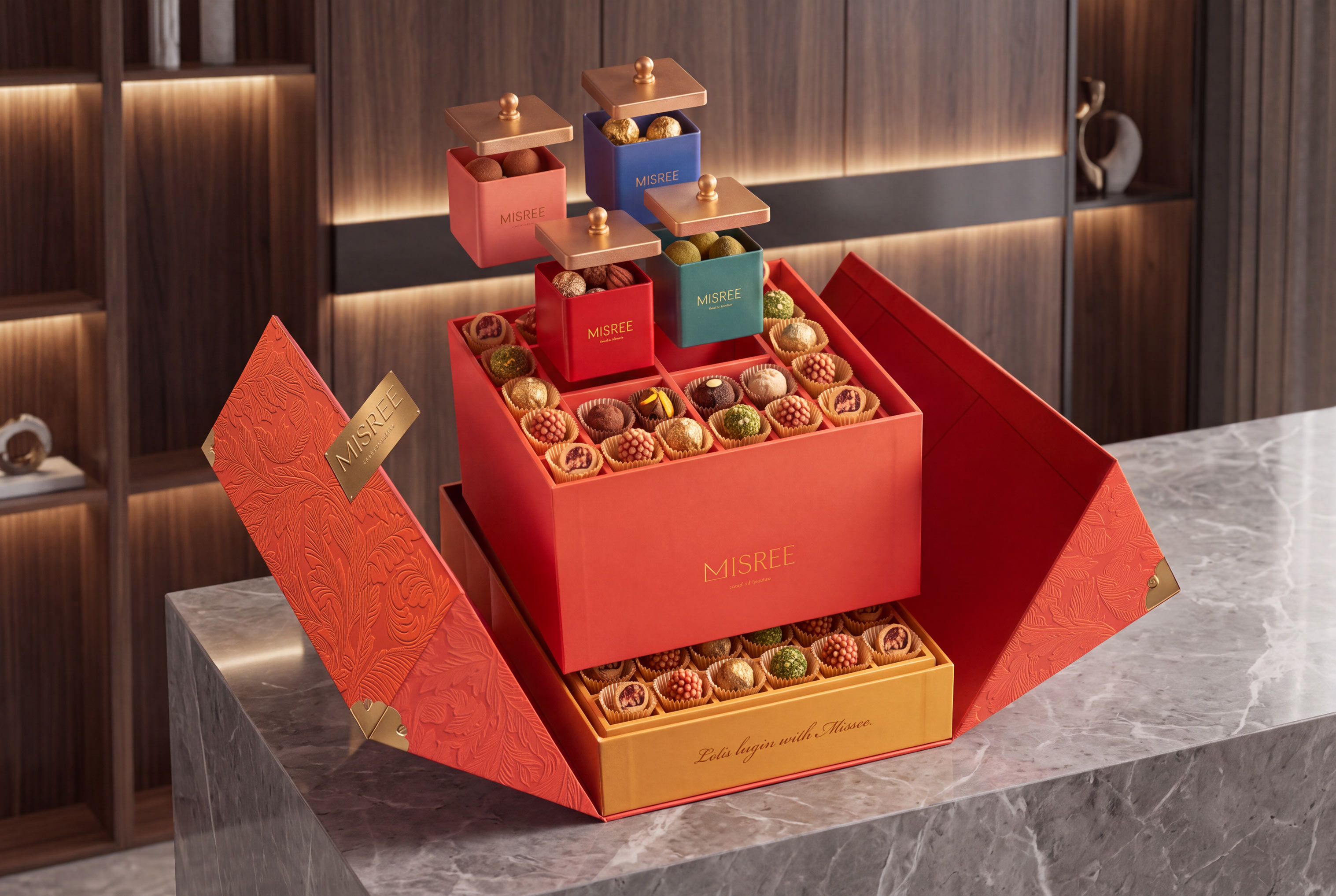
A centre-opening lid frames the interior before the eye adjusts to the full contents. A lasercut jaali overlay filters the view of the mithai beneath, while individual savoury containers with metal lids sit beside the mithai tray, each with its own moment of engagement.
Pouch System
An alternative for occasions that do not call for a hamper. Botanical floral illustration runs across three colourways, with the M monogram in gold and the full brand story on the reverse..
Visual families and materials
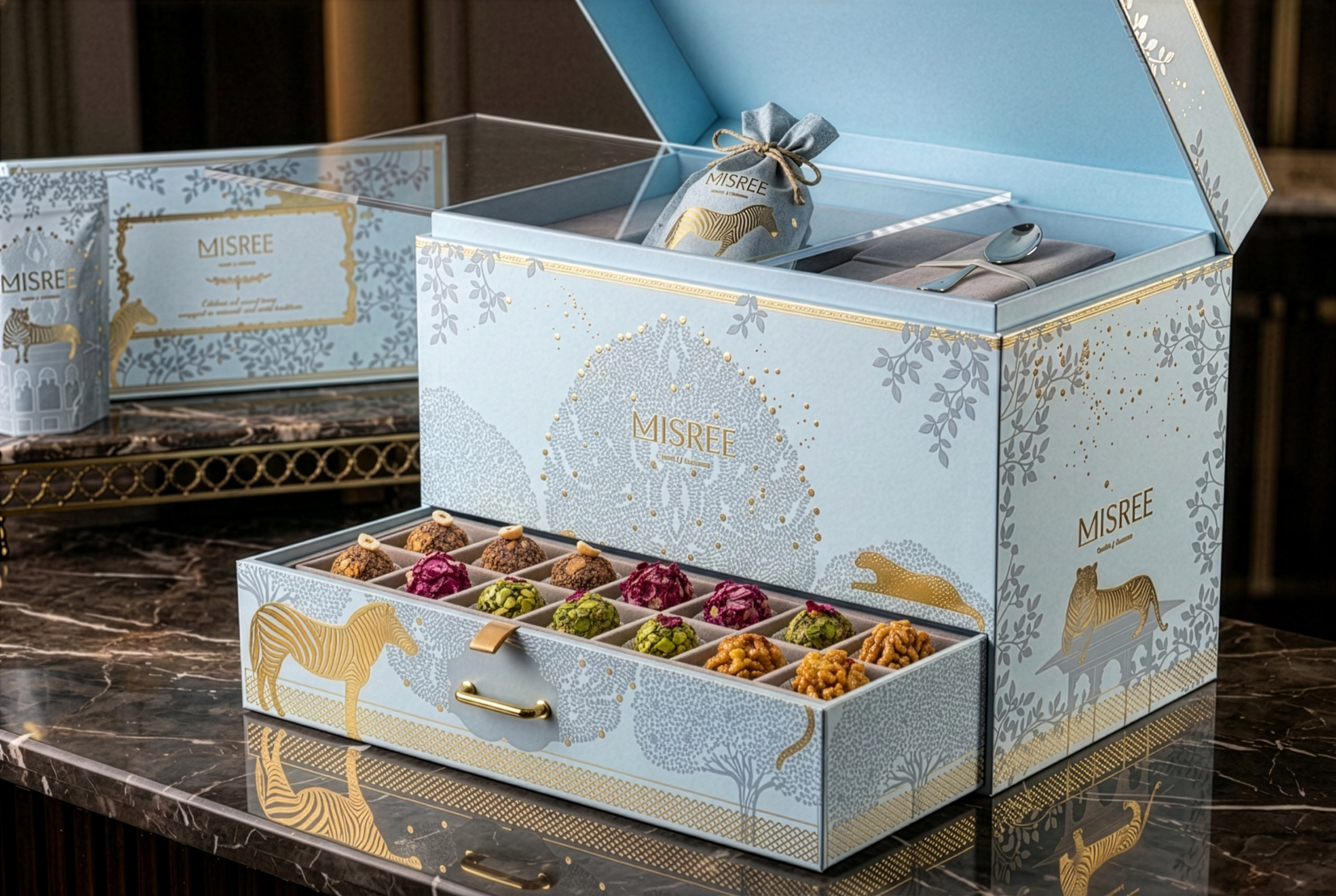
Enchanting Forest paired gold wildlife with constellation-dotted nocturnal grounds across four colourways. Baby Blue Wildlife used silver-grey animals on pale blue for recipients already familiar with the brand. Transparent PVC, lasercut elements, metal lids, butter paper and individually presented containers shaped how each gift opened, revealed and presented its contents. In the Baby Blue hamper, a pull-out drawer of individually set pieces sits beneath a lid that opens onto a pouch and spoon.
04 | The Outcome
One physical platform, expressed across the festive calendarA single structural platform was deployed across multiple festive collections without new development investment each season. Packaging that might have required four separate production briefs was resolved through one investment expressed four ways, which compressed timelines, reduced seasonal development cost and held visual coherence across every occasion Misree needed to address.
A recipient who receives Misree at a wedding, and meets the same brand at a corporate Diwali in a different colourway, recognises it before reading the name. The structure is familiar. The illustration is new. That recognition, accumulating across occasions and years, is how packaging builds brand equity.
The result is a first look that earns attention and an unboxing that rewards it, with refinement in every detail and structure doing the work that decoration alone cannot.
Graphic richness is now widely shared in premium gifting. A coherent structural language is far rarer, and far harder to copy.
Key takeaway
1. Design the opening sequence first. Artwork then has a system to live in.
2. One structure, several colourways: seasonal range without seasonal rebuilds.
3. Reveals extend the interaction, and the interaction carries the brand.
Questions
One physical platform, expressed across the festive calendar
What packaging design did KRT create for Misree by Haldiram?
KRT worked as a design partner on the structural side of the gifting packaging, developing formats including the Hamper System, Peacock Fold, Oval Capsule, Ultra-Premium Hamper and Pouch System.
How did the system support different occasions?
One structural platform served several festive collections while the visual treatment changed. Enchanting Forest launched in four colourways on the same system for Diwali, wedding season and corporate gifting.platform could be used across multiple festive collections while the visual treatment changed. The Enchanting Forest range, for example, launched in four colourways on the same system for Diwali, wedding season and corporate gifting.
What is structural packaging design?
It is the physical architecture of a package: how it opens, folds, reveals, and holds its components. In Misree, these mechanics set the sequence in which the gift is discovered.
How does luxury packaging add perceived value?
By extending the recipient's interaction through lid options, layered openings, pull-out drawers, folding structures and individually presented containers, so that receiving the gift becomes part of the product.
Can one packaging system work across multiple festive occasions?
Yes. Misree shows one structural platform supporting weddings, Diwali, corporate gifting and other requirements through changing visual families.