KRT DESIGN STUDIO Gold Logo
KRT DESIGN STUDIO | CASE STUDY

Brand Identity & Packaging Design for Veda Forest

Positioning a nature-rooted wellness brand as a coherent luxury system, not decorative packaging, but a language that speaks before the product is opened.

Veda forest Gold Embossed logo
01 | The Challenge
A Strong Philosophy Without a Defined Visual Identity
Veda Forest draws inspiration from nature, traditional botanical wisdom, and the ritualistic aspects of wellness. The brand's narrative was rich with meaning, yet there was no visual system capable of expressing that depth consistently across products and customer touchpoints.
The challenge extended beyond packaging design.

The identity needed to communicate craftsmanship without appearing traditional. It needed to feel premium without becoming cold or inaccessible. Most importantly, it needed to create a recognisable presence in an increasingly competitive wellness category.

Every design decision had to contribute to a clear premium positioning before a customer ever interacted with the product itself.
Veda forest brand Mark in blackVeda Forest brand Mark Negative/ reverse colour
BRAND POSITIONING MATRIX | WELLNESS LUXURY INDIA
Brand Positioning Matrix, Wellness Luxury India
Veda Forest Brand Mark in base colour goldVeda Forest Brand Mark in 3D sculptured embossed.
WHAT EXISTED
Nothing. Built from zero.
Veda Forest had no visual identity before KRT. No mark, no colour language, no packaging logic, Everything you see was created from the starting point.
WHAT WAS NEEDED
A coherent luxury identity
Every touchpoint, from primary mark to secondary packaging closure, expressing the same considered intelligence. The brand recognisable before the logo is read.
THE MARKET TRUTH
Wellness is crowded at mid-tier
Dozens of Indian wellness brands occupy the "natural and pretty" quadrant. None have claimed the ultra-premium quadrant with conviction. That space was open.
THE OPPORTUNITY
Ancient intelligence, modern luxury
Veda Forest's naming, Vedic depth, forest provenance, gave us an anchor point from which a full visual universe could be constructed with coherence and authority.
02 | Brand Strategy
Create the Foundation Before the Expression
Strong brands are built through systems.

Before developing visual assets, packaging formats, or colour palettes, we established the strategic principles that would guide every design decision across the brand.

The goal was consistency and every future touchpoint needed to feel connected to the same story, values, and positioning.
Strategy I
Define a Singular Brand Narrative
We anchored the brand around one central idea:
"Ancient botanical wisdom, expressed through modern wellness rituals."
This narrative informed every subsequent decision, from identity development and packaging design to material selection and customer experience.
Strategy II
Reframe Botanical Luxury
We chose a different direction. Rather than presenting nature as raw or handcrafted, we positioned it as refined, intentional, and premium. Botanical illustration became a storytelling device rather than decoration. Heritage became a source of distinction rather than nostalgia.
Strategy III
Design Beyond the Label
Luxury is experienced through a sequence of interactions. We mapped the entire customer journey, including primary packaging, secondary packaging, closure systems, inserts, tissue wrapping, gifting elements, and carrying bags before developing individual assets. This allowed every touchpoint to contribute to a unified luxury unboxing experience.
Strategy IV
Use Materials to Reinforce Value
In premium packaging design, material choices influence perception as strongly as visual design.
Paper stocks, finishes, textures, embossing, and construction methods were selected to support the positioning of the brand and create a tactile experience consistent with luxury wellness products.
Veda Forest: Ultra Premium Hamper top cover for Baby Girl
Veda Forest: Ultra Premium Hamper box Inside details for Baby Girl
03 | DESIGN THINKING
Premium Packaging Design and Brand Identity Development
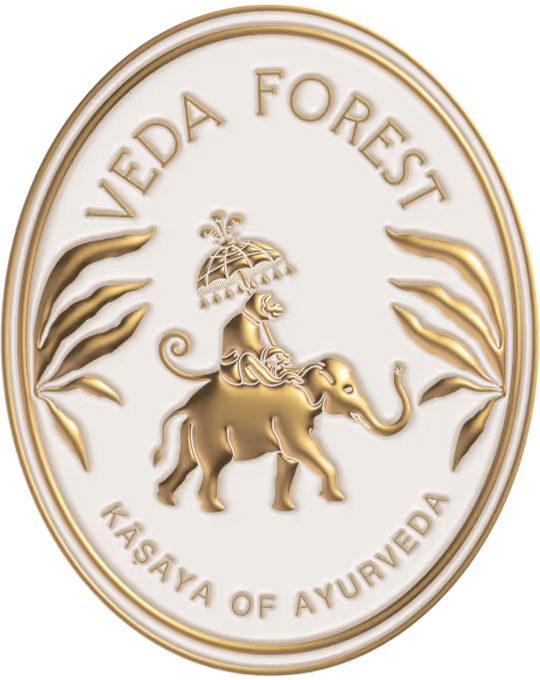
The Primary Brand Mark
We developed a logo that balances structure and organic influence.
Drawing from both botanical forms and timeless emblematic design, the mark provides flexibility across applications ranging from packaging seals and labels to larger brand environments.
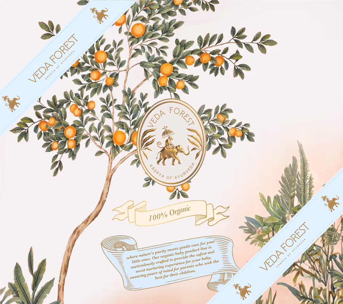
Colour Architecture
The colour palette takes inspiration from forest landscapes, botanical ingredients, traditional manuscripts, and natural materials.
Rich greens, warm ivory tones, and metallic gold accents create a visual language that feels both rooted in heritage and relevant to contemporary luxury consumers.
Typography as Tone
Typography was treated as an extension of the brand personality.
A disciplined type system creates consistency across packaging, print collateral, digital communications, and future product extensions while allowing the visual storytelling elements to remain prominent.
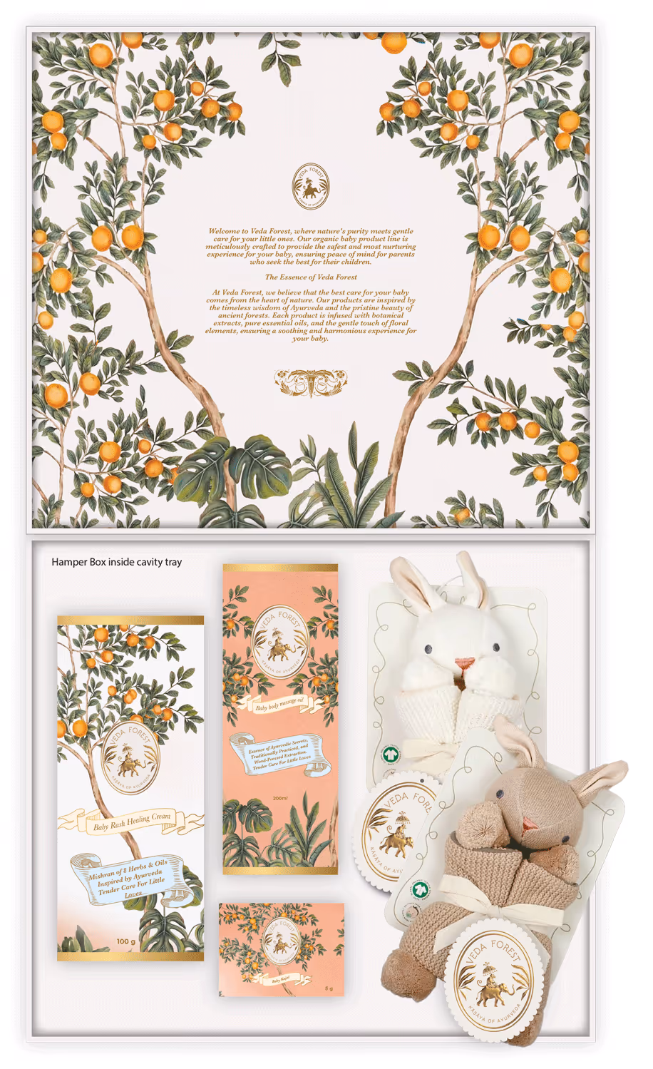
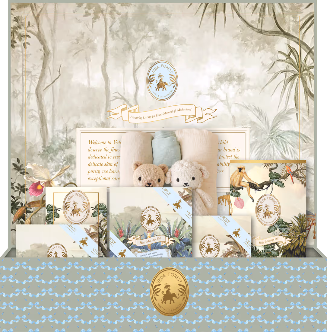
Packaging Structure
The packaging experience was designed to encourage discovery.
Each layer of interaction contributes to a deliberate luxury unboxing experience, creating anticipation while reinforcing product value. This approach is particularly important within premium skincare packaging, wellness gifting, and luxury hamper design, where presentation plays a central role in customer perception.
Finishing Specification
Embossing, metallic detailing, premium laminations, and tactile finishes were specified with restraint and purpose.
Every production choice contributes to how the brand feels in hand, supporting both perceived value and product positioning.
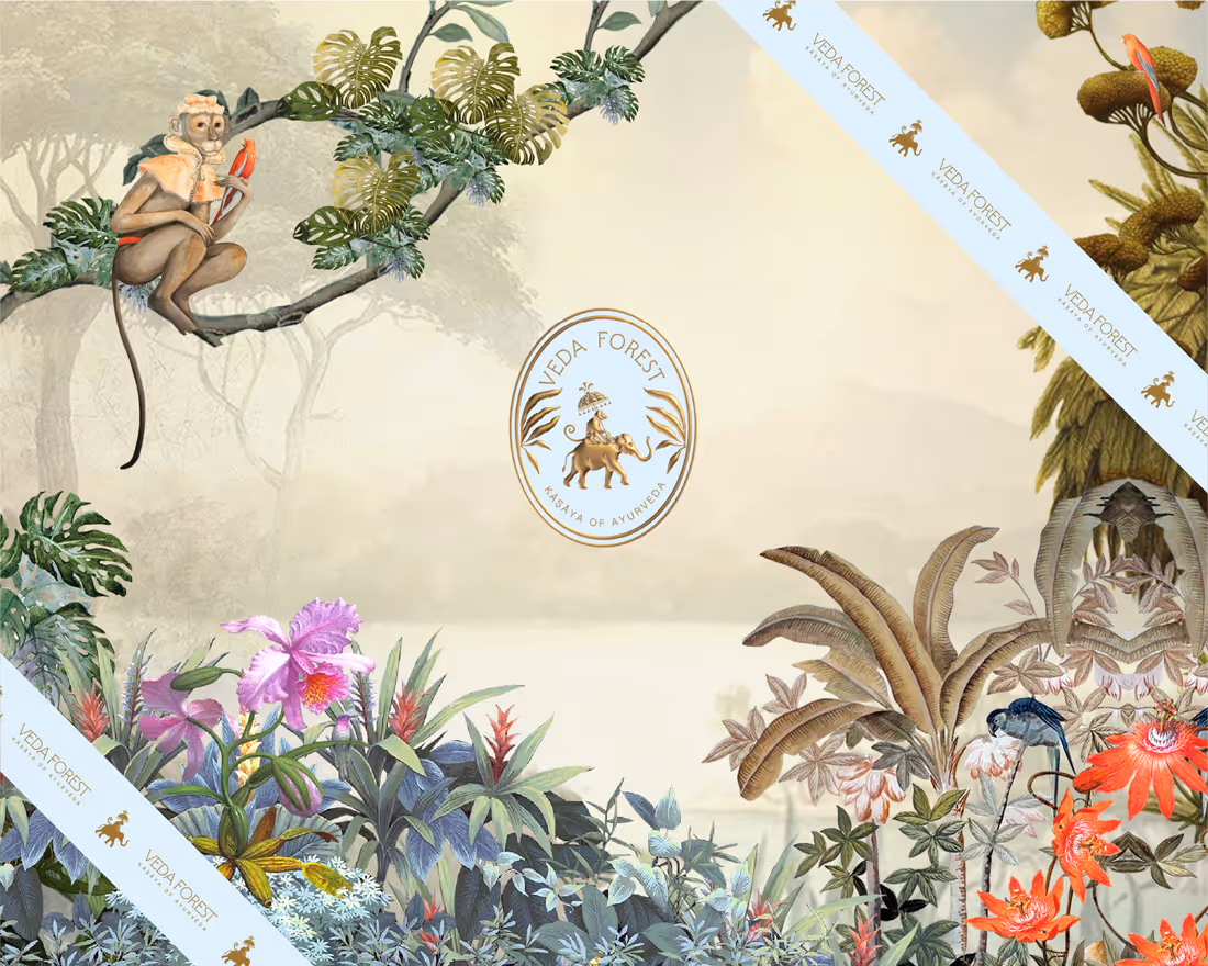
Brand Governance
To ensure consistency as the business grows, we developed a comprehensive identity system documenting colour usage, typography standards, packaging specifications, production guidelines, and approved applications.
The result is a brand designed to scale without losing coherence.
Veda Forest Hamper for Mother care. Box top cover
Veda Forest Hamper for Mother care. Box Inside elements
04 | THE OUTCOME
A Premium Wellness Brand Built for Growth
Veda Forest launched with a complete visual ecosystem.

The identity, packaging, materials, and brand standards work together to communicate a consistent message across every customer interaction.

Customers encounter a brand that feels intentional, refined, and trustworthy before engaging with the product story itself. The packaging reinforces quality. The visual language creates recognition. The overall experience supports premium positioning.

By combining botanical storytelling, Ayurvedic heritage, and contemporary design principles, Veda Forest established a distinctive position within the premium wellness category.

The result is a brand that feels authentic to its roots while remaining relevant to modern consumers and international markets.
6x
Increase in Perceived Price Positioning Consumer perception shifted significantly following the introduction of the new identity and packaging system.
100%
Touchpoint Coverage Every customer-facing interaction, from logo application to final packaging closure, was designed and documented.
1 idea
One Central Brand Narrative Ancient botanical wisdom expressed through modern wellness rituals informed every design decision.
0 drift
Zero System Drift Comprehensive brand guidelines ensure consistency across production, marketing, packaging, and future expansion.

KRT Design Studio is a luxury branding and packaging design agency creating brand identity systems, premium packaging, hospitality experiences, wellness branding, and bespoke corporate gifting solutions for ambitious founders and established businesses.

Our work combines strategic thinking, visual storytelling, and commercial positioning to help brands build lasting value through design.

KRT DESIGN STUDIO | BRAND PHILOSOPHY