01 | THE CHALLENGE
A Growing Packaging Range Without a Consistent Visual Language
Wishes — Luxury Gifting by Om, a unit of Om Sweets Private Limited, came to KRT Design Studio with strong products, established trade relationships, and packaging that had developed organically over time.
Each box responded to a particular product, season, or gifting occasion. The range had warmth and variety, but there was no single visual thread connecting a modest mithai box to a full wedding hamper.
The challenge extended beyond individual packaging formats.
Wishes needed a visual language capable of making the brand recognisable across different products and occasions while giving each format enough room to retain its own character. A customer should be able to encounter a scalloped architectural frame, a particular colour relationship, or a gold-foiled jharokha and begin to associate those cues with Wishes before reading the name.
KRT Design Studio approached the project through Signature System Architecture, integrating luxury brand identity, packaging structure, and colour discipline into one repeatable visual system.
WHAT EXISTED
A packaging range built organically
Wishes had developed its packaging box by box and season by season. Individual formats had their own visual character, but the range lacked a continuous visual language connecting different products and occasions.
WHAT WAS NEEDED
One recognisable visual grammar
The system needed to connect mithai boxes, gifting hampers, everyday formats, and physical brand touchpoints while allowing each application to have its own composition.
THE BRAND OPPORTUNITY
Recognition before the name
KRT identified the opportunity to create recurring visual cues strong enough for the brand to be recognised through its architecture, colour, illustration, and finishing before the wordmark was consciously read.
THE APPROACH
Signature System Architecture
The studio audited the existing packaging library across box formats, seasonal collections, and touchpoints from carry bags to the boutique shelf. The work focused on identifying the visual elements that could become lasting brand cues and developing them into a repeatable system.
02 | BRAND STRATEGY
Build the Visual Grammar Before Expanding the Packaging
Strong packaging systems require decisions that can hold across formats.
Before extending the identity across the full range, KRT examined how the existing Wishes packaging could be organised around a more deliberate visual language. The studio looked at the relationship between architecture, illustration, colour, wordmark placement, and finishing to establish principles that could guide future applications.
The central question was practical: could the packaging change while the brand remained recognisable?
STRATEGY I
Create a Recognisable Architectural Language
KRT studied Rajasthani architecture as a structural reference, focusing on jharokha windows, scalloped jaali arches, chhatri domes, and the layered facades of Udaipur's lake palaces.
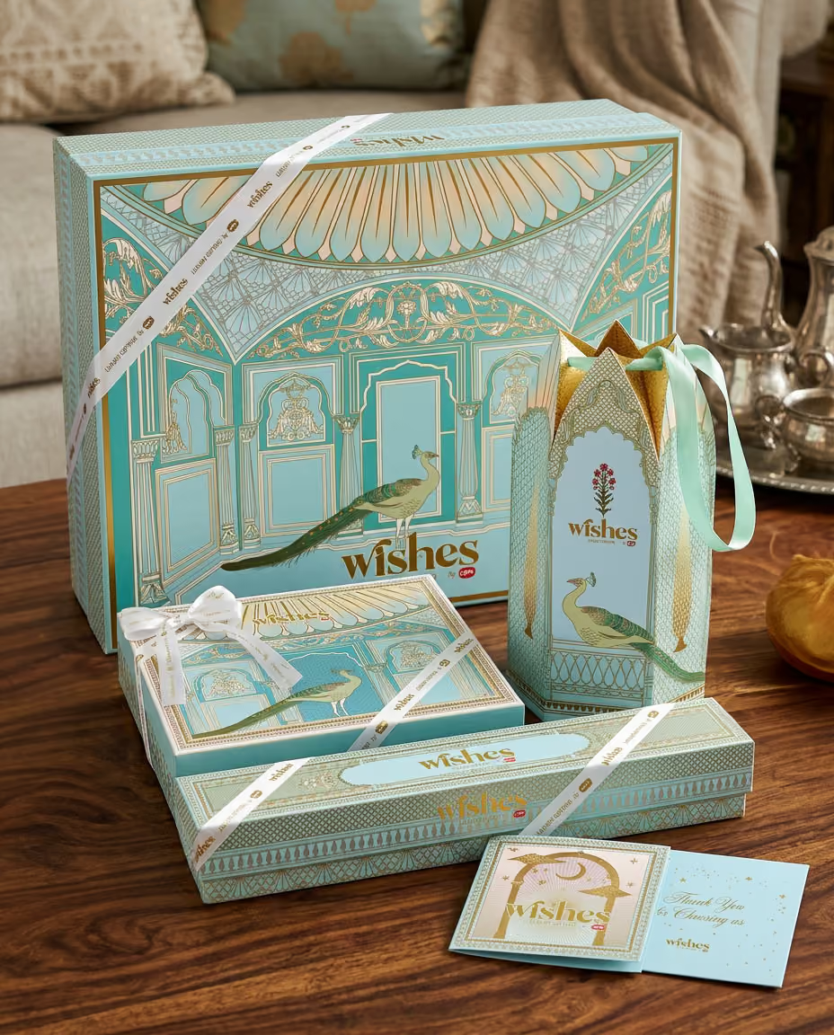
The scalloped arch became the central recurring form. It could frame the wordmark, establish a distinctive silhouette, and repeat across packaging, carry bags, and hamper trays.
The architectural reference gave the brand a visual structure that could remain consistent while individual packaging formats took on different elevations.
STRATEGY II
Develop a Disciplined Luxury Palette
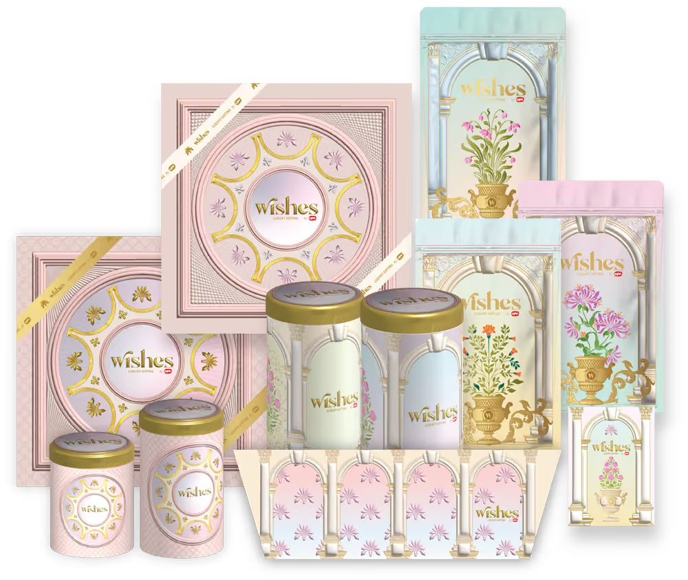
The colour system was built around baby pink, dusty rose, powder blue, sage teal, and warm gold.
The proportions shift between product families. A box of nine can lean into peacock pink and teal, while a box of sixteen can move toward softer pink-and-green florals.
The colours remain connected across the range, while warm gold is reserved for specific details including architectural outlines, the wordmark, and ribbon elements.
STRATEGY III
Make the Architecture Carry the Wordmark
The wordmark was positioned within the architectural frame, allowing the identity to become part of the structure of the packaging.
The same scalloped silhouette could then repeat across different applications. As the form appeared across box lids, carry bags, and hamper trays, the architecture itself became one of the cues through which Wishes could be recognised.
STRATEGY IV
Treat Every Surface as Part of the Brand
KRT extended the visual language beyond the primary box.
The exterior and interior of packaging, ribbons, cards, carry bags, and retail surfaces were considered as connected brand touchpoints. This allowed the same visual decisions to accumulate across the customer experience rather than remaining confined to the product itself.
03 | DESIGN THINKING
Luxury Packaging Design Across Multiple Scales
The Signature System Architecture had to work across a wide range of packaging formats. KRT developed the system so that each application could carry its own visual composition while remaining recognisable as part of Wishes.
THE BOX FAMILY
Six, Nine, Ten & Sixteen Pieces
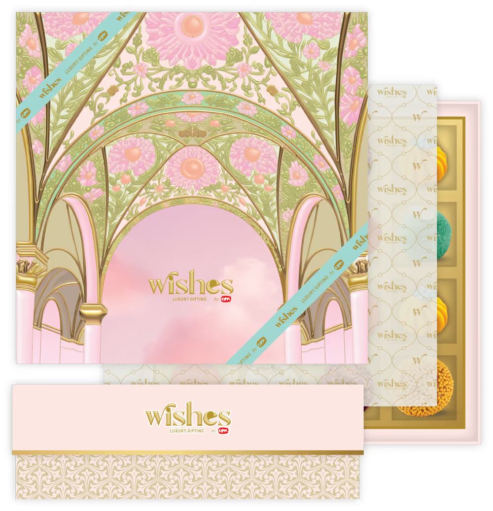
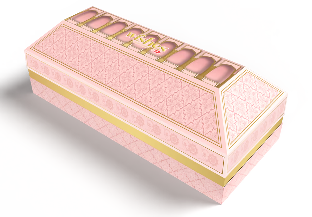
The Wishes box family was developed across six, nine, ten, and sixteen-piece formats.
Each box carries its own architectural elevation. The visual references include a palace gateway, a peacock-feather dome, a lotus pond, and a fuller facade with domes and chhatris.
The compositions vary by format, while the shared border logic and gold-outline treatment connect them as one packaging family.
This allows a customer to encounter different Wishes boxes across different occasions while continuing to recognise the same visual world.
THE GIFTING HAMPER
17 × 17-Inch Architectural Presentation
The same visual language was scaled into the 17 × 17-inch hamper trays.
At this larger format, the Lake Palace illustration becomes a full architectural backdrop across the tray, with elephants and florals framing the corners.
The scale changes significantly from a mithai box to a wedding hamper, but the architectural language continues to connect the two formats.
EVERYDAY FORMATS
Extending the System Beyond Festive Gifting
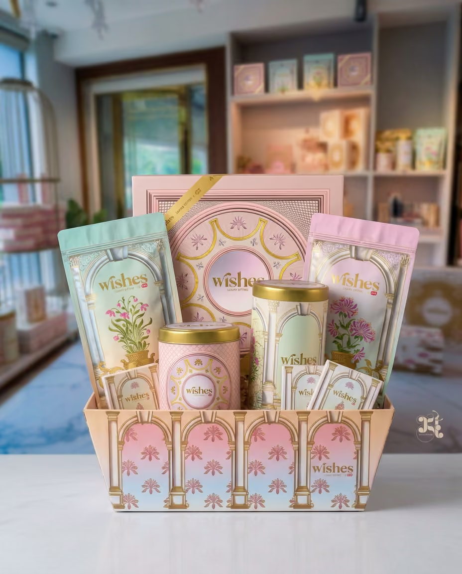
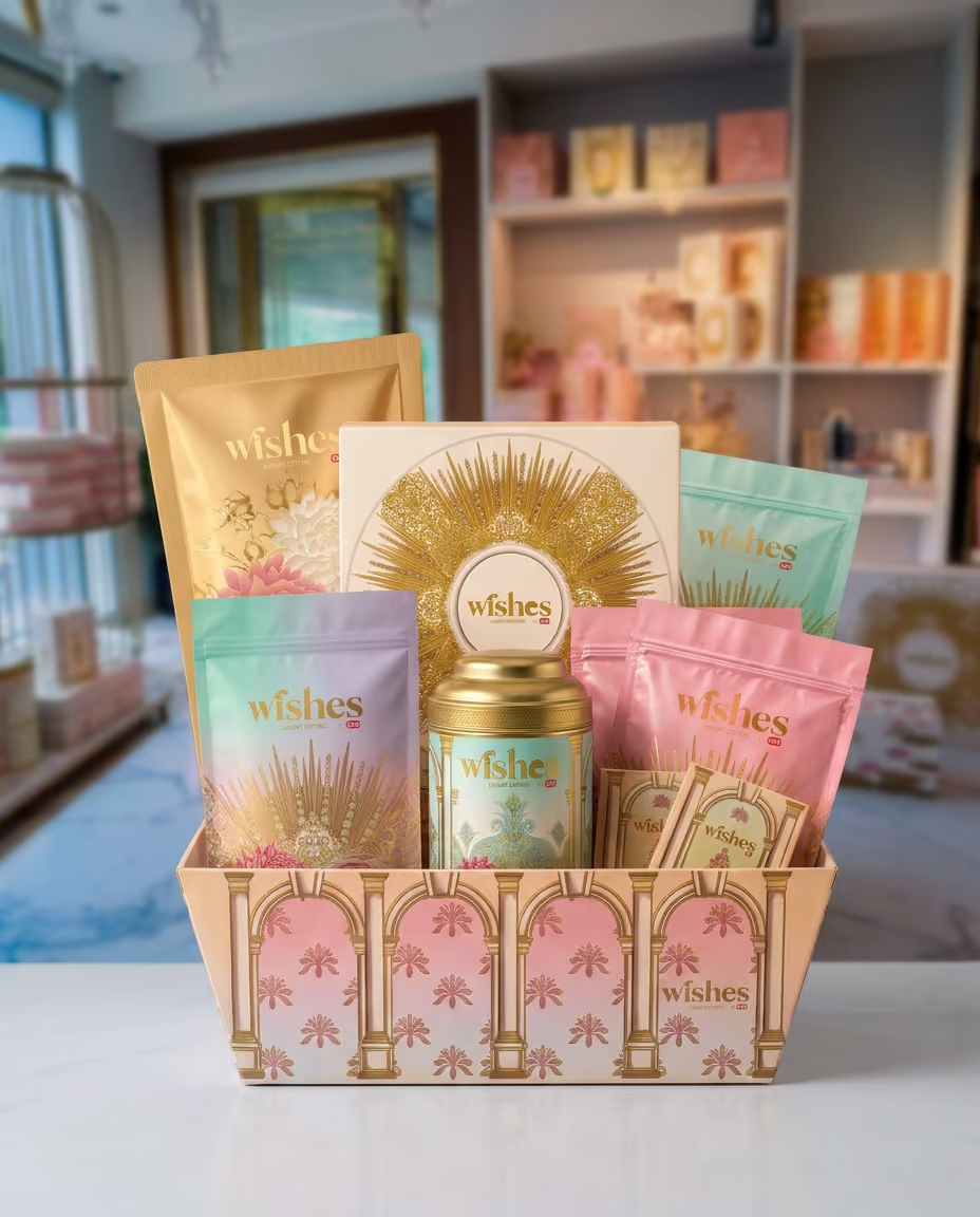
The visual system also extends into resealable snack pouches, protein bars, and everyday-format SKUs.
The same arch-and-column framing remains present, with the treatment softened into a lighter register.
The range therefore moves from wedding gifting to everyday products while maintaining the underlying visual relationship established across the Wishes packaging system.
FINISHING LANGUAGE
Gold as a Defined Brand Cue
Warm gold was used selectively across architectural outlines, wordmark applications, and ribbon details.
This gave the metallic treatment a consistent role across the packaging family and allowed it to support recognition without becoming the dominant visual element.
04 | THE RETAIL CONNECTION
The Boutique Interior Came First
The Wishes boutique already had an established visual environment before the packaging system was developed.
Its baby pink and powder blue walls and gold-trimmed shelving were already familiar to customers as part of the Wishes experience.
KRT drew the packaging colour system directly from this existing retail interior.
The same pinks, blues, and gold moved from the room onto the packaging, creating a direct relationship between the physical space and the products customers carried away from it.
The packaging therefore became visually connected to an environment customers already associated with Wishes.
THE BUSINESS MARK
Recognition Across Every Customer Touchpoint
KRT's approach extends beyond the box to product, packaging, ribbon, card, and physical retail space.
Together, these surfaces create what the studio calls a business mark: a set of consistent visual cues that allows recognition to develop across repeated customer encounters.
The customer can recognise the architectural form, colour relationships, and overall visual language as Wishes without having to consciously identify the logo first.
05 | THE OUTCOME
A Luxury Packaging System Built for Recognition
Wishes entered the project with packaging that had developed organically across products, seasons and occasions. KRT gave that range a common visual language built around Rajasthani architectural references, a disciplined colour palette and a repeatable approach to packaging and gifting.
The six, nine, ten and sixteen-piece boxes each carry their own architectural elevation while sharing the same visual cues. The 17 × 17-inch hamper trays extend the language into larger wedding gifting formats. Everyday applications such as snack pouches and protein bars carry the same architectural framing in a lighter register.
The packaging palette — baby pink, dusty rose, powder blue, sage teal and warm gold — was drawn directly from the existing Wishes boutique, connecting the physical retail environment with the packaging customers take home.
The result is a brand that can change its packaging from one product or occasion to another while retaining the visual cues that make it recognisable as Wishes.
WHAT CHANGED
From Individual Packaging to a Recognisable Brand Language
The project gave Wishes a visual relationship across formats that did not exist before. Architecture, colour, illustration and gold detailing now work together across mithai boxes, wedding hampers, everyday formats and retail touchpoints.
WHAT IT ENABLES
A Foundation for Future Growth
The established visual language gives Wishes a foundation for extending into future formats, including regional festive collections, corporate and hospitality gifting, and new retail environments.
KRT Design Studio is a luxury branding and packaging design studio working across luxury brand identity, premium packaging, gifting systems, hospitality and bespoke brand experiences for ambitious founders and established businesses.
If your packaging has developed over time without a clear visual language connecting the range, KRT can begin by auditing what already exists and identifying the elements that can become lasting brand cues.
To discuss a luxury brand identity or packaging project with KRT Design Studio, get in touch with the studio to explore how your existing brand can develop into a more recognisable and scalable visual language.